Design a site like this with WordPress.com
Get started

Power BI with Traffic Light Indicator

Today you will learn how can you implement a traffic light indicator functionality in Power BI.

Power BI allows you to conditionally format a column based on another column value. Traffic Light indicator also works based on a value which is provided in the given column.

I will be implementing the Traffic Light Indicator functionality in the same report which we created while learning Add hyperlinks to CRM record in Power BI.

Figure 1: Image of Add hyperlink to CRM records in Power BI post.

Let’s get started. You need to add a new column to your dataset as shown in the below image:

Figure 2: Adding new column to dataset
Figure 3: Created New Column

Rename the column as “Indicator” for better understanding.

After renaming use a Circle UNICHAR code 11044 next to Indicator for populating a Circle icon in the column.

Indicator = UNICHAR(11044)
Figure 4: Using Circle UNICHAR code11044

Select the table and check the box which appear next to Indicator column under dataset. This will add the Indicator column under report.

Figure 5: Added Indicator column to the report.

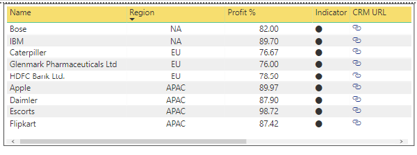
The circle under Indicator column will appear in black color.

For enabling the traffic light capability, you need to right click on the Indicator column and select Conditional formatting –> Font color. This will change the Font color of circles.

Figure 6: Right click on Indicator column
Figure 7: Select Conditional formatting –> Font color

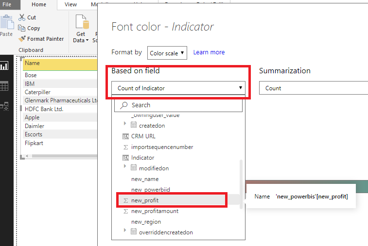
The below screen will appear, click on Based on field dropdown. Select the column based on which the traffic light indicator would work.

Figure 8: Font color default screen

In my case I am going to use Profit %(new_profit) column. Which is the third column in our table.

Figure 9: Select field based on which the traffic light indicator would work.

Go to Diverging and check the box which appear next to it. This will populate a new field “Center” between “Minimum” and “Maximum”.

Figure 10: Check the Diverging field

Select Number value under the dropdown which appear below Minimum, Center and Maximum fields. Provide the number range for the Indicator column based on this the traffic light functionality would work. Then click OK.

Note: The color bar which appear below the Diverging field is totally based on the colors which you select under the Minimum, Center and Maximum fields.

Note: I have taken the minimum number as 0 which mean the number which appear nearest to 0 under Profit % column will appear as brightest red and the number which is nearest to 70 will appear the brightest yellow. The number which appear somewhat near 50 will be a mix of Red and Yellow color.

Figure 11: Enter value range for Indicator

Now, you have got the functionality that you wanted. The Indicator column appear as a Traffic Light Indicator.

Figure 12: Traffic Light Indicator
Advertisement

Power BI with Microsoft Dynamics CRM

Download Power BI Desktop , it comes with both 32 bits and 64 bits. Gets this installed.

After the Power BI installation is completed it launches with the Welcome screen.

Figure 1: Power BI welcome screen

For establishing a connection with any data source, you will need to click on the Get data icon which is visible on the welcome screen. Else you can click on the Get Data button which is visible on the untitled page as shown in the below image:

Figure 2: Connect with Data Source

Click on More –> Online Services –> Dynamics 365 (online)

Figure 3: Connect with Dynamics CRM

Clicking on Connect button, a screen will appear asking for CRM Web API URL.

Figure 4: Power BI Web API URL

Login to CRM –> Go to Settings –> Customization –> Developer Resources

Figure 5: CRM Setting (Customization) page

Copy the link from Service Root URL which appears under Instance Web API section.

Figure 6: CRM Web API

Enter the copied CRM Web API link in Power BI, under Web API URL field. Click OK button. This required for establishing a connection between Power BI and your CRM Organization.

Figure 7: Power BI Web API

The below screen will appear when the connection gets established between Power BI suite and Dynamics CRM.

Select the CRM entities by clicking on the check box which appear next to them. This is required for pulling data only for the selected entities, then click Load button.

Figure 8: Connection established

This would take some time depending on the number of entities selected for loading.

Note: If you don’t want the entire fields from the entity to get loaded. You can narrow down the fields by click on Edit button.

If user clicks on Edit button, Query Editor Page will open. Click on “Choose Columns” button under Home tab.

Figure 9: Option to choose require columns for report

Select the require columns/fields which are required for reporting. You can search the field directly by entering the name of the field under Search Columns.

Figure 10: Select required fields for report

Clicking on OK button, the Query Editor will have only the selected field.

For reflecting the changes Click on “Close & Apply” button then select “Close & Apply” option.

Figure 11: Close & Apply for reflecting the changes.

Finally, the data gets Loaded. I didn’t filter the column while loading the entity as shown in Figure 8 therefore all the columns got populated as shown under red box.

Figure 12: Data Loaded for Entity

You can now start with your Power BI Report by selecting any option under Visualization.

Visualization brings our data into life in the form of amazing visual representations.

Starting with Power BI

What is Power BI?

Power BI is a cloud based Data Visualization and Business Intelligence tool which help the users to read the data from different data source. It is a collection of services, apps, and connectors that work together to turn your unrelated sources of data into a unified logical format, visually immersive, and interactive insights.

Why Power BI?

Power BI allows quick and easy insight into the data which helps in developing interactive dashboard and reports. User can connect to the data whenever and wherever they want for analyzing and visualizing data.

Ways to use Power BI

  1. Power BI Service (Interactive Data Visualization BI Tools)
  2. Power BI Desktop (Desktop Version)

Let’s get started with Power BI using its desktop version. The reports created within Power BI Desktop can be publish directly from the Desktop application to Power BI Service.

Tasks which can be performed using the Power BI suite:

  1. Can get the data from different data sources.
  2. User can establish a relationship between the data for enriching their data model.
  3. Data can be visualized in many different format like Bar and column charts, Cards, Area charts, Gauge charts, Funnel charts, KPI’s, Maps, Tables, Matrix etc.
  4. Publish the report.